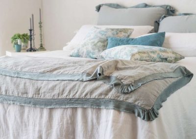
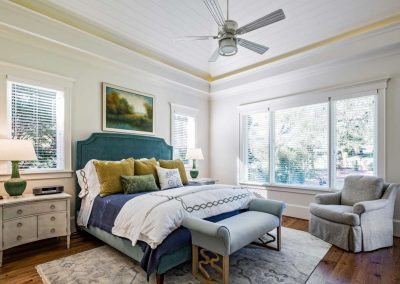
When we think of February, we think of candy, red roses, and romance. Well, romance can come in many different forms. For instance, a great master bedroom. Some folks forget about the bedroom and save it until last to decorate. I think it is as important as the kitchen, family room, and master bathroom. So, when you are making your list of things to do for the New Year, think about the master bedroom and how to give it a romantic facelift. The first thing I would do is hire a designer, because they can see a canvas in their heads that you cannot see. The job will be easier and less time consuming to have a professional involved.
First, you need an inspiration of what you want. Will it be all whites and neutral or do you want some variation of colors? Sometimes we just want a change. A bedroom should be inviting and relaxing. Soothing colors such as blues are classic. It can calm your busy mind. Blues can help you sleep, however keep it soft. Creams, which can have the feeling of warmness and candlelight, are incredibly relaxing. Soft pinks and soft greens are also good choices.
If possible, I like to start with the rug. If it is vintage or oriental or a pattern, pull the least expected color from it to tie into the bedding or the walls. Of course, it is classic to have a white or cream coverlet and shams and add layers of some colors on top of that. Sometimes, it is a chore to find the correct bedding to work with the new décor, but we have multiple lines of bedding and can always find something you will like.
My own bedroom and bathroom are torn up and getting a fresh paint job, new vintage rug, and new bedding. Of course, all of this is because we had a cracked tile floor in the bathroom that was not originally installed properly. We lived with the cracked floor for fifteen years before deciding to fix it. We knew it was going to be a mess to live in for a few months to attempt to replace it. This is what I do for clients and I can sympathize with them. The tile I selected for myself to replace the broken floor is Calacatta porcelain tile in sizing l2 x 24. All in the works for a year now. I can’t wait to finish it! So, basically the colors are coming from the tile for the rest of the décor, meaning the bedroom ensemble and the wall color. My selection for paint color to coordinate with the tile is Paper White by Benjamin Moore. It’s a beautiful hue of barely blue. Colors do not always work the same in every house. We study the light and how it comes into a room before selecting the color. I might try a few samples, painted on boards, at different times of the day in someone’s home before the decision is made. I also like the pearl base finish by Benjamin Moore, due to the reflective ability to bounce light off the walls. A chair in my bedroom is a deep blue velvet by Lillian August. That pop of deep blue will add another dimension to my room. I plan to find the right accent boudoir pillow for the element of surprise to tie it all together. I purchased my very nice SFERRA bedding a year ago when I found out they were discontinuing the very light blue hue fabric that I salivated over from the time we got it into the store until they discontinued the group. For one year, the duvet has rested on top of my dresser awaiting the right time to redo the master bedroom and bath. I knew one day it would happen. I am patient, because the canvas has been created in my head and I know how to complete it, but you need to be patient until all the right pieces of the puzzle are put together. Let us create your canvas with Originality and we will do all the leg work.
God Bless,
June


