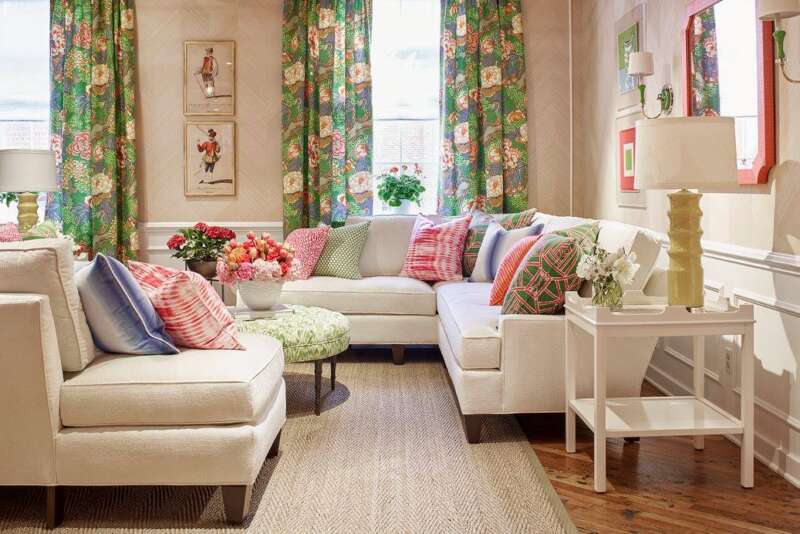
Everything we are reading in Design World says the days of cool greys are behind us. Builder magazines and designer magazines are all saying the same thing. If you are finding yourself looking at creams and earth tones, you are among the rest of us. My own house has cream tones with accents of blues and other colors. If you stay with the cream tones, more than likely you will always be in a classic color family that never leaves as for instance, greys. Grey is a good neutral, but it was overdone and overused or it would probably be in the top ten colors for the upcoming year. When we work on houses that are dark inside, whether it is due to how the house is situated or due to dark furnishings, grey is not normally a good color to use either way. When the front porch is covered and the back porch is covered, then the best color would be a light cream color. The light is already diffused with grey if you have covered porches. So, the obvious solution is to lighten the walls with a more reflective lighter cream. Keeping up with the times is not always easy to do, but it is our job as a designer and contractor firm. If a customer calls us to help them with colors in their home, we look at changing the lighting and the wall colors. That is the easiest way to update a house and to get your best light. Don’t paint your ceilings if you have a lighting issue, due to how light reflects off of white the best.
Some of the fall colors are greens, light orange, green blue, and black and sometimes those are used as accent walls against bright white walls emphasizing the architecture. This draws the eyes in unexpected ways. It is okay to move toward the furnishings to be colorful. There is always a lot of white involved against the bold move.
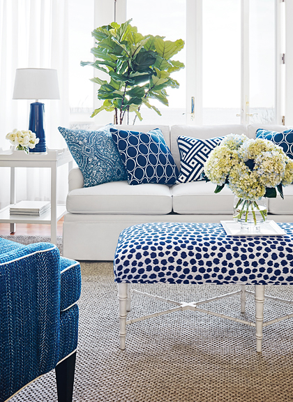
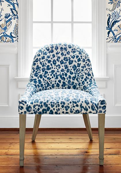
It is our policy to stay with color blocking using rugs, furniture, and accessories as our color load. We like the neutrality of cream or lighter walls.